What Makes a Living Room Feel Finished (6 Layers)
Every living room is its own architectural problem. Two rooms with the same square footage and the same furniture can need entirely different treatments. The ceiling height, the window placement, the doorways, the focal points already in the architecture, the pieces a client refuses to part with, all of it shapes what a finished room looks like for that specific space.
But after enough projects, the patterns repeat. In a typical living room, the same six layers in roughly the same order resolve most of what makes a room feel finished or unfinished. Before any aesthetic decision, I ask:
- How many people regularly use this room, and how many when you host?
- What is the room for, conversation, TV, hosting, or all of those?
- How do people enter and move through it?
- What direction do your windows face, and when do you use the room most?
- What pieces are you keeping no matter what?
Function before style. The answers to those five questions shape every stage that follows.
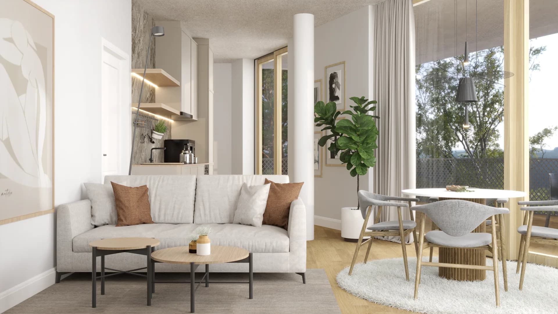
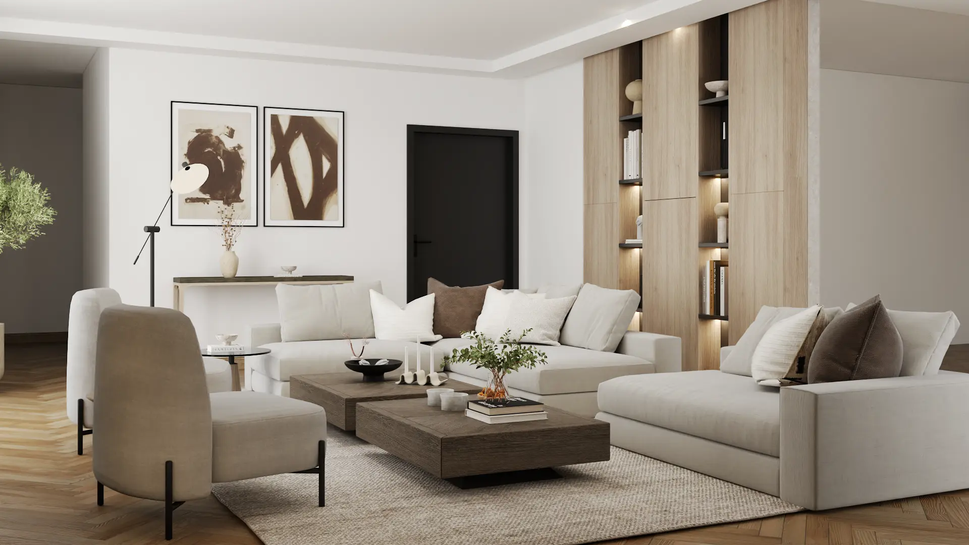
The Palette in This Room
Earthy warm undertones across every surface. The boucle and jute pull the linen and oak together so nothing reads orphaned.
1. Start with how many people sit here
The first decision is the seating layout, and the seating layout is a function question, not a style question. How many people actually use this room on a regular Tuesday night, and how many when you host. A room that holds three every night and eight a few times a year is a different room than one that holds two every night and never hosts.
Once the people count is honest, the layout follows. Where the conversation happens. Where the TV lives, or whether the room is built around a fireplace or the windows instead. How traffic flows through. A sofa pushed flat against a wall to maximize floor space almost always reads as a passthrough room. A sofa pulled even a few inches off the wall, angled toward a focal point, with chairs facing it, reads as a destination.
Layout and flow checklist
- One focal point in the room, not four.
- Seating fits weekly use, with room for guests.
- Every seat faces another seat, not the doorway.
- Sofa pulled a few inches off the back wall.
- Traffic flows around the seating, not through it.
- You can talk to another seat without raising voices.
2. Size the rug to the seating, not the room
Once the seating is placed, the rug sizes to it. The rule I work by is simple: the rug should hold the front legs of every seat in the conversation. Anything smaller and the rug looks like it was bought for a different room.
This is also where most empty-feeling rooms went wrong years ago. A rug chosen before the seating tends to be too small because it was sized for the room rather than for how the room would be used. A rug chosen after the seating, and sized to it, anchors everything that lands on top. Patterned vintage rugs, the Persian and Turkish and Moroccan kind, do double work. They ground the seating and they hand you a palette to build everything else from.
3. Soften the windows and add the pillows
Windows and pillows belong in the same stage because they are both textile work, and they soften the room together. A room with hard architecture, bare windows, and a sofa with the pillows it shipped in still reads unfinished, no matter what else you do to it.
Full-length drapes are the answer for the windows. Hung high, hung wide, long enough to almost touch the floor. Linen, cotton, simple weaves in soft neutrals. The fabric softens the architecture before any other piece is touched.
The sofa pillows that came with the sofa always have to go. They were styled for a showroom, not a home. Two or three pillows in textures that contrast with the upholstery, in a color borrowed from the rug, do more for the sofa than a new sofa would.
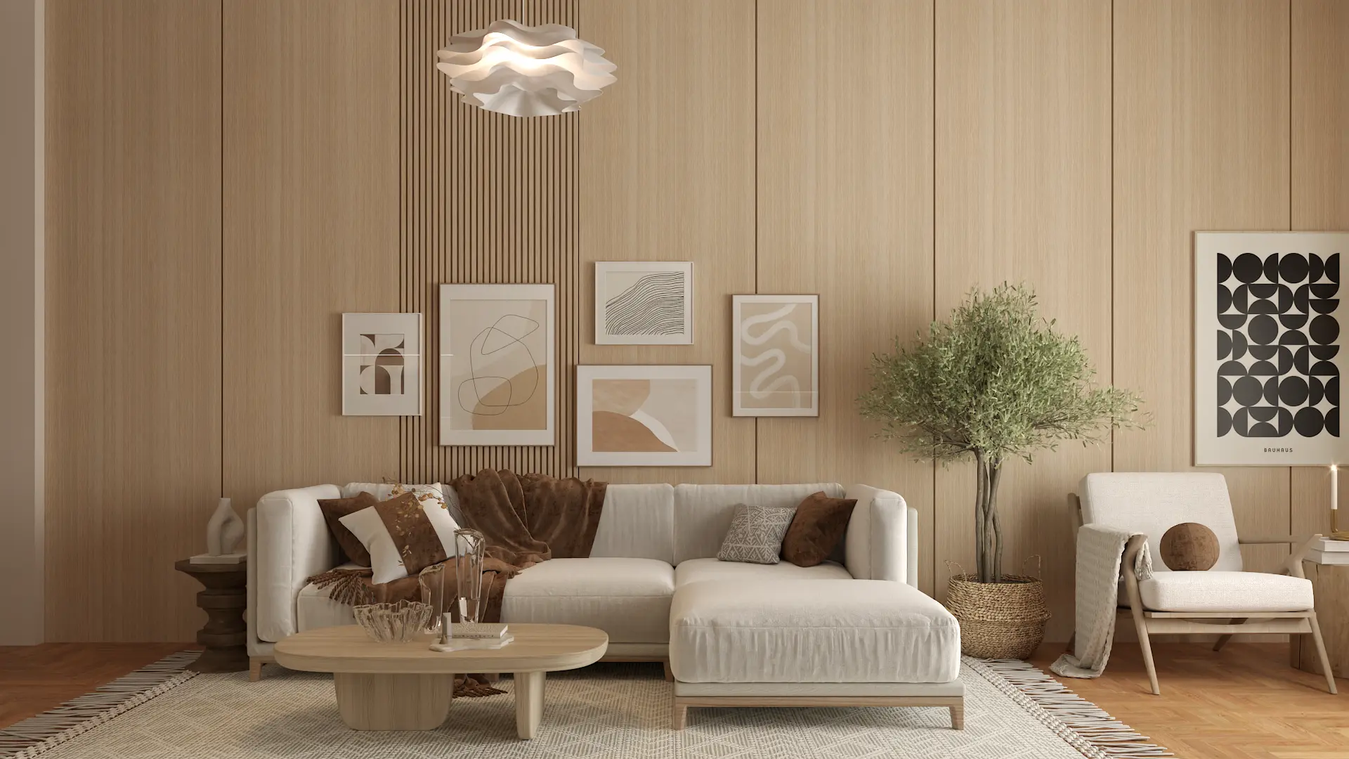
The Palette in This Room
A neutral cream sofa reads warm because the drapes and pillows carry the color story. Honey wood ties the soft palette to the architecture.
4. Hang the art for the seated viewer
Art comes after the seating, the rug, and the textiles because by now the room has a palette, and you are choosing art that confirms a color story already in motion, not guessing at what colors live there.
The most common art mistake I diagnose is hanging it too high. People hang art relative to the ceiling, when art should be hung for the person sitting on the sofa. Lower than you think. Closer to the eye than the crown molding. Galleries get this right because they have to.
The second most common mistake is buying three small unrelated frames and spreading them across one wall. A single oversized piece beats it almost every time. A gallery wall works if every frame follows one rule and breaks no others. Same color frames, or same subject, or same orientation. One variable changes, everything else holds.
5. Design the lighting around what is already there
Lighting comes near the end on purpose, because lighting is a response to everything that came before it. You cannot light a room well until you know where the seating sits and where the art lives. The art needs to be lit. The seating needs warm light at sitting height. The corners need filling.
Lamps before overheads. Warm bulbs before cool. Multiple sources at sitting height instead of one bright fixture above the room. The overhead is for cleaning. Everything else is for living. A room I would call finished almost never has the overhead on by itself, and almost always has three or more sources at the height of the people using it.
6. Save the personal decor for last
Personal objects go last because they cannot land until everything beneath them has. A perfectly styled shelf above a half-finished room reads as staging. The same shelf in a fully layered room reads as someone's life.
Small groupings, varied heights, nothing matchy. A book, a vessel, a candle. Not three identical jars in a row. A ceramic vase, a stack of books, a single dried branch in a stoneware urn. The decor layer is where the rules end and the choices begin. This is also where the room stops being mine and becomes yours.
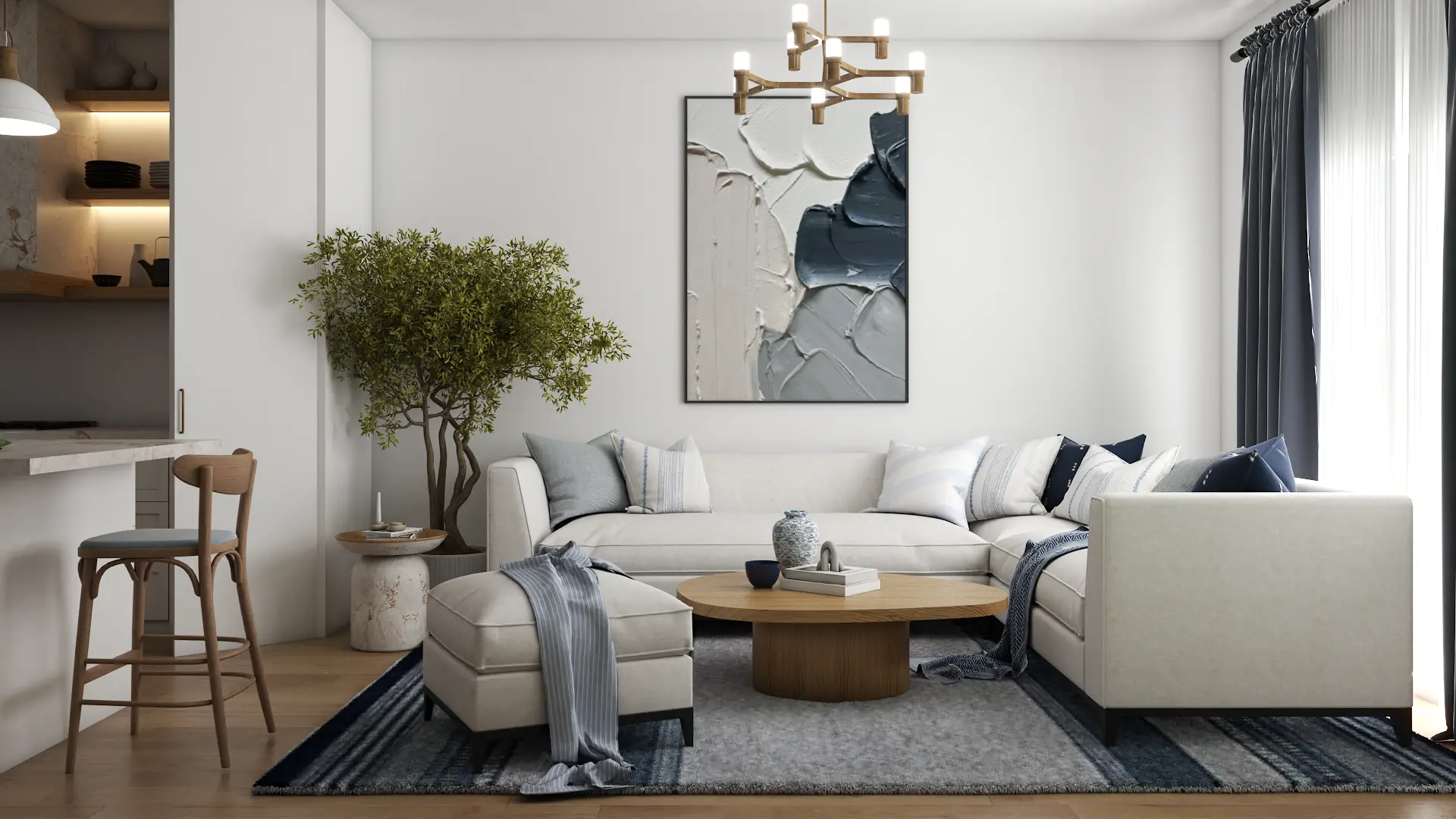
The Palette in This Room
A neutral palette earns its warmth from the oak and the sand rug. The charcoal framing keeps the eye from drifting and grounds the styling at each height.
Why this order works for most rooms
This is the part clients tell me they wish someone had explained earlier. You can have all six layers in a room and the room can still feel wrong. You can have only four of the six and the room can feel finished. The difference is whether each layer was added with the previous ones already in place to anchor it, or whether the room was assembled by whoever called the dibs first.
Every room is its own problem. The architecture changes the priorities, the existing pieces change the palette, the way you live changes the layout. But the order is the part that stays the same. Function before form, function before style, function before any decision that is about how the room looks rather than how it works.
How I plan it for clients
The version of this work I do for clients is the same six layers, planned in 3D before anyone orders anything. You send me your room photos, your inspiration, and a sense of how you want the space to feel. We talk through the five questions. About two weeks later you walk through your finished room in a 360-degree virtual tour with every layer placed in the order it belongs. If anything reads off, it changes before a dollar leaves your account. Pricing starts at $600 a room.
Does that help? If your room feels half-done, the missing piece is probably not another piece. It is the order of what is already there, or the next layer added in the right place. If you want me to plan that for your specific space, book a free consultation.