Living Room and Bedroom in One Room: Zones Without Walls
The bed was the problem. Not the sofa, not the desk: the bed, which had to live on the same open floor as both of them without turning the whole room into a bedroom by six in the evening.
Living and working share a room easily. Sleeping resists. Putting a living room and bedroom in one room means planning from the bed outward, so that is where I started. The three zones the client asked for kept their shape: a Living area, an Office Area, and a Bed Area, all on one floor. No walls anywhere, except a single glass partition.
What holds it together is not the layout. It is one warm neutral palette, repeated in every zone until the room reads as one composition.
What Changes When a Bed Joins a Living Room and Office?
Adding a bed changes what privacy means in a shared room. A living area and a home office can look straight at each other all day and neither one suffers. A bed cannot. It is the only zone that needs the option of being shut away, so it takes the room's single real boundary while everything else stays open.
Here is where one open room usually goes wrong, and I say this kindly: each corner gets furnished as its own tiny room. A small seating set in one, a desk set in another, a bed pushed against whatever wall is left over. Three little rooms, none of them good, all of them competing for the same eye.
So I stopped treating the corners as rooms. The Living area, the Office Area, and the Bed Area are three jobs sharing one floor, not three floor plans sharing an address.
How Do You Divide a Room Without Walls?
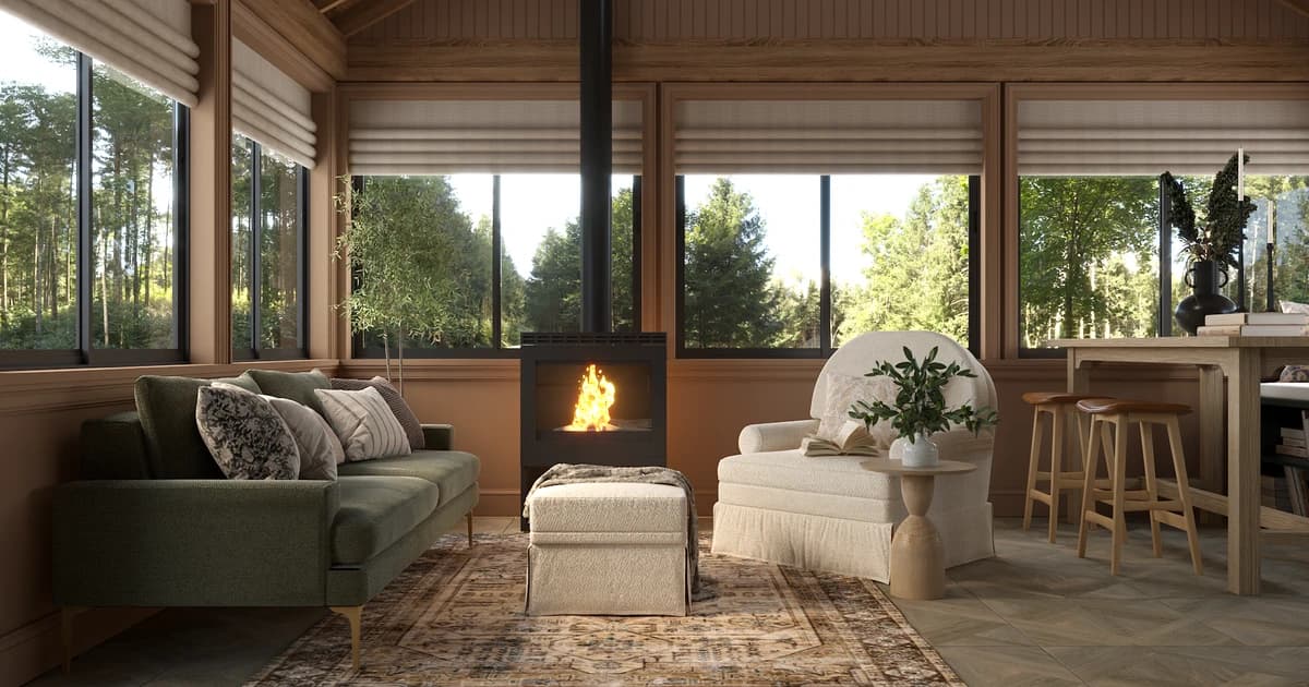
Three things do the work walls would have done: layout, furniture placement, and lighting. In that order, with the furniture chosen last. Grouping the functions before you shop is the step people skip, and a sunroom carrying a lounge, an office and a library walks through that method in a room of a different shape.
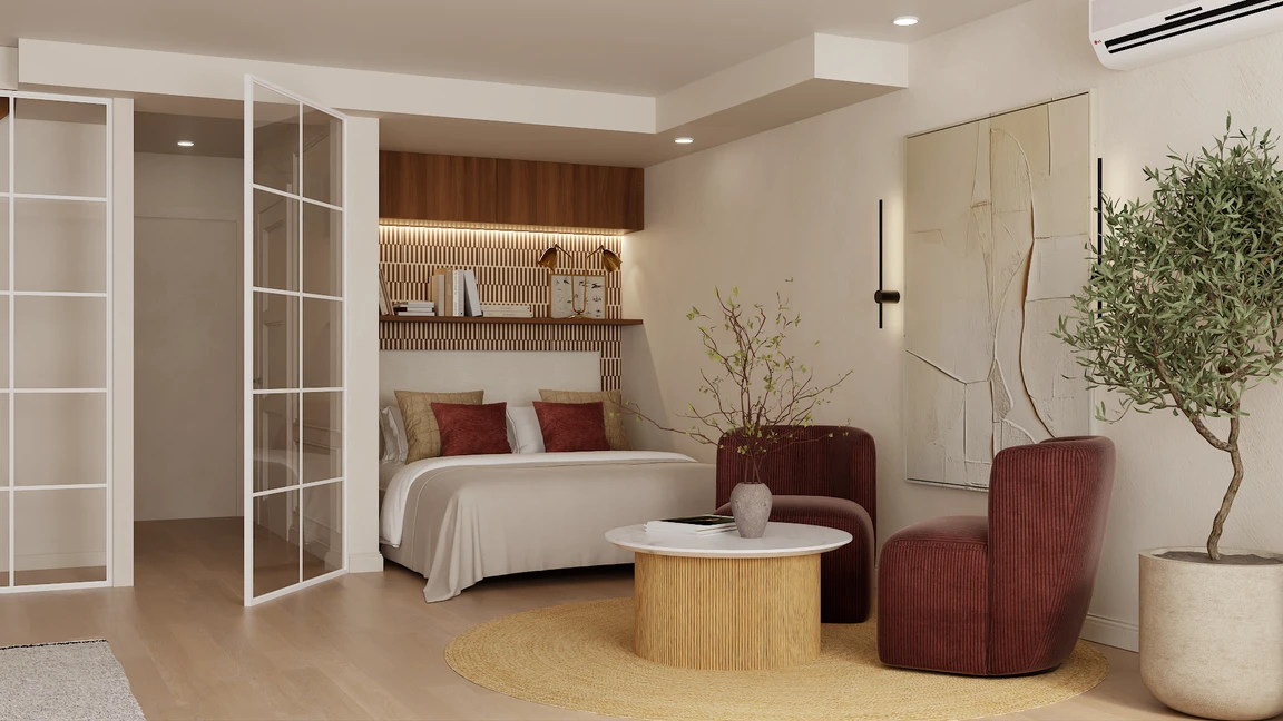
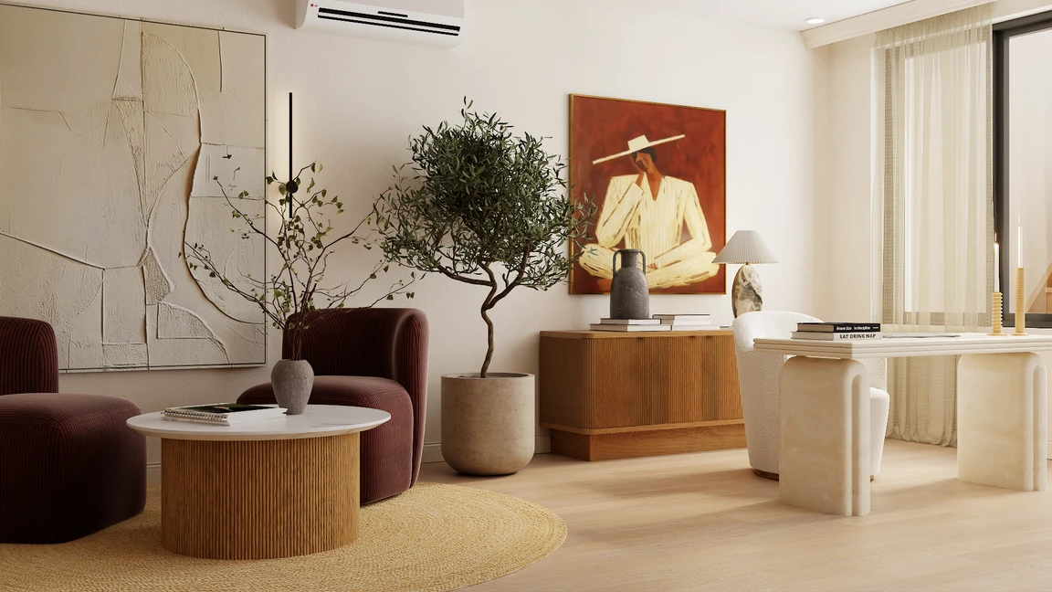
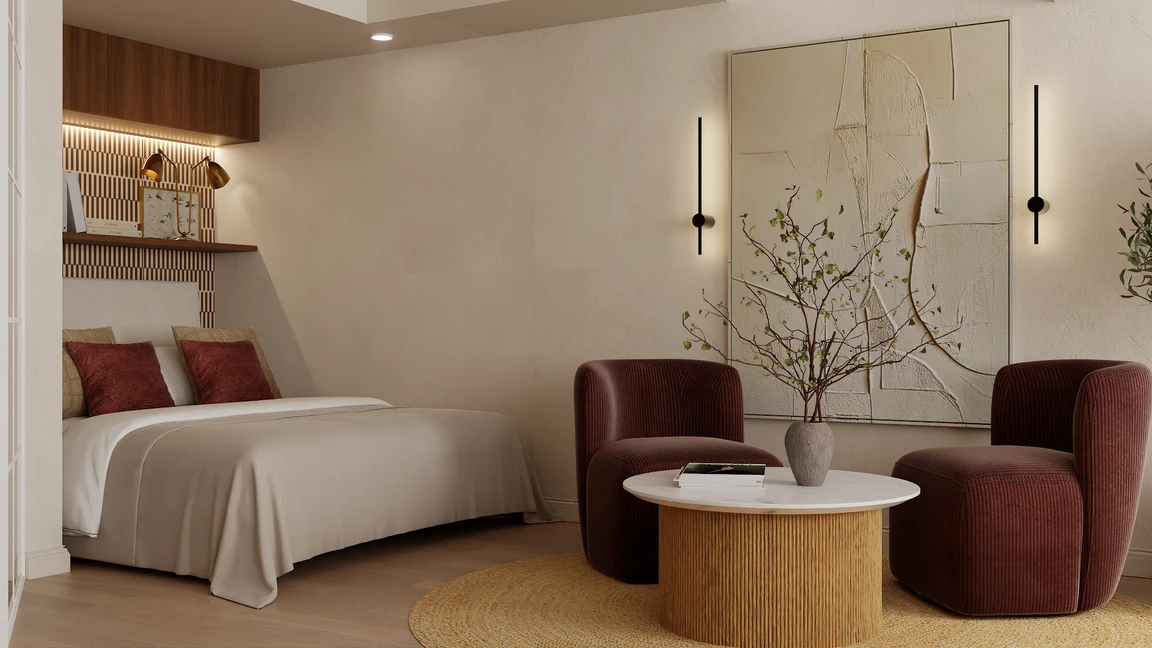
Placement draws the lines you feel without seeing. A round jute rug, two burgundy ribbed velvet club chairs and a fluted oak table sit between the Office Area and the Bed Area, so you cross a boundary without passing a wall. That group reads as a conversation nook from the desk and as a sitting spot from the alcove. One arrangement, two jobs, no partition.
Lighting gets decided early on my projects, well before the furniture list is final, because in a room without walls the light is structural. Brass reading fixtures over the bed, an arched floor lamp with a woven rattan shade in the Living area, a warm LED strip under the alcove's upper unit. Each zone owns its own light, which means each zone can be switched off on its own. The theory behind layering it sits in my guide to lighting a room. Here it does one job only: drawing edges.
What Color Palette Ties a Living Room and Bedroom in One Room?
One palette, every zone. That is the device doing the separating work walls would normally do, and it is why three functions read as one room rather than three.
Warm neutrals get called safe. They are not safe, they are patient. I chose this range knowing the room has to outlive a few changes of taste, and a palette that survives is worth more to me than one that peaks in a season. The accents are what keep it from going flat: burgundy, terracotta and olive carry real weight here instead of decorating the edges.
Each accent lands somewhere specific. Burgundy takes the club chairs and comes back in the pillows on the bed, terracotta sits in the vessels along the built-in and the portrait above the credenza, and olive arrives as the tree in its raw concrete planter. Not one of them raises its voice, which is exactly the argument for using them: a warm tone can make a statement and still keep the room whole.
Warm Neutral Palette
Warm Ivory sets the plaster walls, the boucle and the bedding. Sand Beige runs through the curtains and linen. Natural Oak was fixed with the plan, in the built-in, the credenza and the floors. Burgundy Clay, Terracotta and Olive Green arrived with the furnishings, in the velvet chairs and pillows, the portrait and vessels, and the olive tree.
Why Texture Works Better Than Pattern in One Open Room
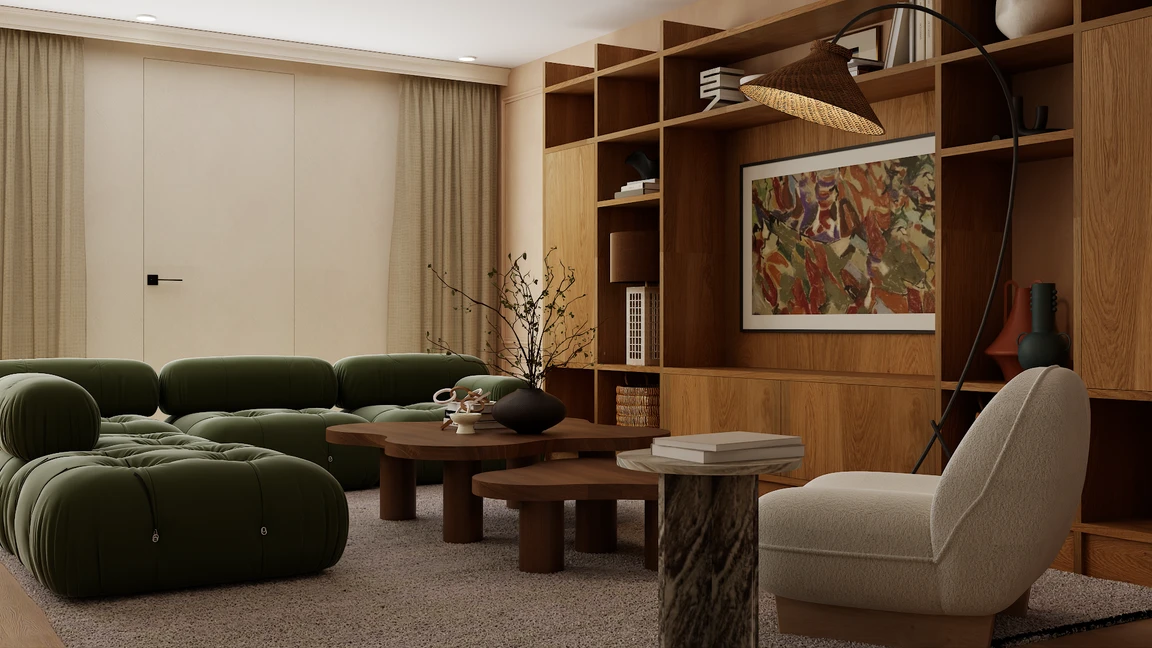
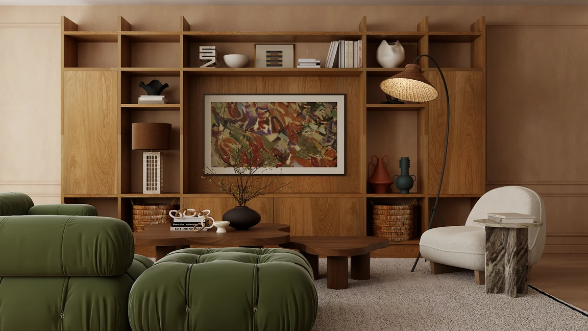
Pattern would have been the loud answer here, and the wrong one. Repeat a print across three zones and the eye starts counting repeats. Texture carries the same interest quietly. Boucle on the accent chair, veined stone on the side table, woven rattan on the lampshade, fluted oak on the credenza and the round table. Ribbed velvet on the club chairs, plaster on the walls and troweled relief on the artwork. Six materials, one color story, no noise.
The oak built-in is the test case. It runs floor to ceiling and it is styled at well under what it could hold: terracotta vessels, a few books stacked flat, woven baskets, one framed abstract sitting in the central recess. The empty cubbies are not unfinished, and I know how badly a wall like that makes you want to fill it. They are what makes the full ones look chosen. Styled under capacity, the built-in looks more expensive than it would packed. A wall this sculptural does not need the help.
How One Repeated Accent Makes Three Zones Feel Like One Room
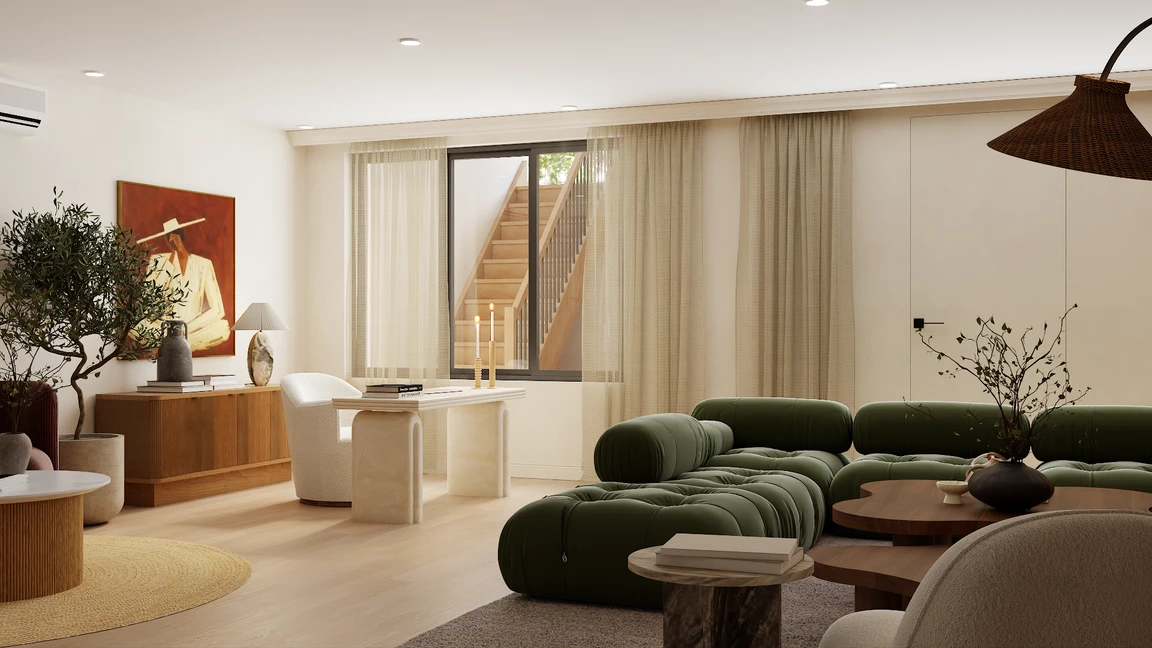
This is the move that does the heavy lifting, and it costs nothing but discipline at the shopping stage. Cream boucle appears twice: once as the low-slung accent chair in the Living area, once as the rounded barrel task chair at the desk. Burgundy velvet appears twice as well, in the pair of club chairs by the plaster artwork and again in the pillows on the bed.
That is an echo, not a matching suite, and the difference is the whole point. Buying the sofa, chair and ottoman as one boxed set flattens a room, because everything in it arrives already agreeing. Repeating one material in two different shapes does the opposite. The eye finds the cream chair at the desk, remembers the cream chair by the sofa, and stitches the two zones together without being told to.
One render holds the stone-legged desk, both boucle chairs and the green sofa at once, and nothing in it announces where one zone ends. Tailored is the word for it: one room, three jobs, and no seams showing.
Why a Glass Partition Is the Only Wall the Bed Area Needs
Every other boundary in this room is implied. One is real, and the bed gets it: white-framed grid glass doors that close the alcove off from the rest of the floor. One real boundary in a whole room puts a lot of weight on a single call, and I will admit I sat with this one. Glass, because the sleeping area shares the room's daylight. A solid door would have made it a closet with a bed in it.
The alcove does the softer half of the work before those doors are ever closed. A wooden upper unit brings the ceiling down over the pillows, a fluted panel behind the headboard gives that wall vertical texture, and an LED strip tucked under the unit keeps the recess glowing at low light. It becomes a room inside the room, which is what a bed needs and a sofa does not.
Beyond that upper unit, storage is the one thing I would keep out of the alcove. A built-in closet system deserves its own wall in a footprint this tight.
The layout travels, too. A compact apartment, a guest suite, a flexible one-room floor: the same three moves apply, because not one of them depends on square footage.
A room does not need more walls to hold more of your life. It needs one palette, one repeated material, and a boundary placed where privacy actually matters. So before you buy the sofa, settle where the bed is allowed to live. That one call comes first. Get it right and the rest of the room falls in behind it. If you would rather not make that call alone, that is what an online interior designer is for. I take clients in every US state. The whole project runs online, start to finish.
Book a consultation and I will set the layout, palette and lighting first, so you shop once and buy right.
Book a ConsultationFrequently Asked Questions
Answers drawn from 2,000+ projects and real client conversations.